Introduction: Harmonizing Tradition with Modern Demands
In contemporary architecture, chapel renovation represents a critical balancing act: harmonizing the historical context and structural honesty of the building with the functional requirements of the modern era. The following analysis of a chapel renovation—a project that reinterprets traditional red brick architecture through modern materials and function—demonstrates the direction space design should pursue. This project integrates the seemingly contrasting values of solidity and openness into its materials and layout, creating a versatile space that offers both spiritual sanctuary and community functionality.
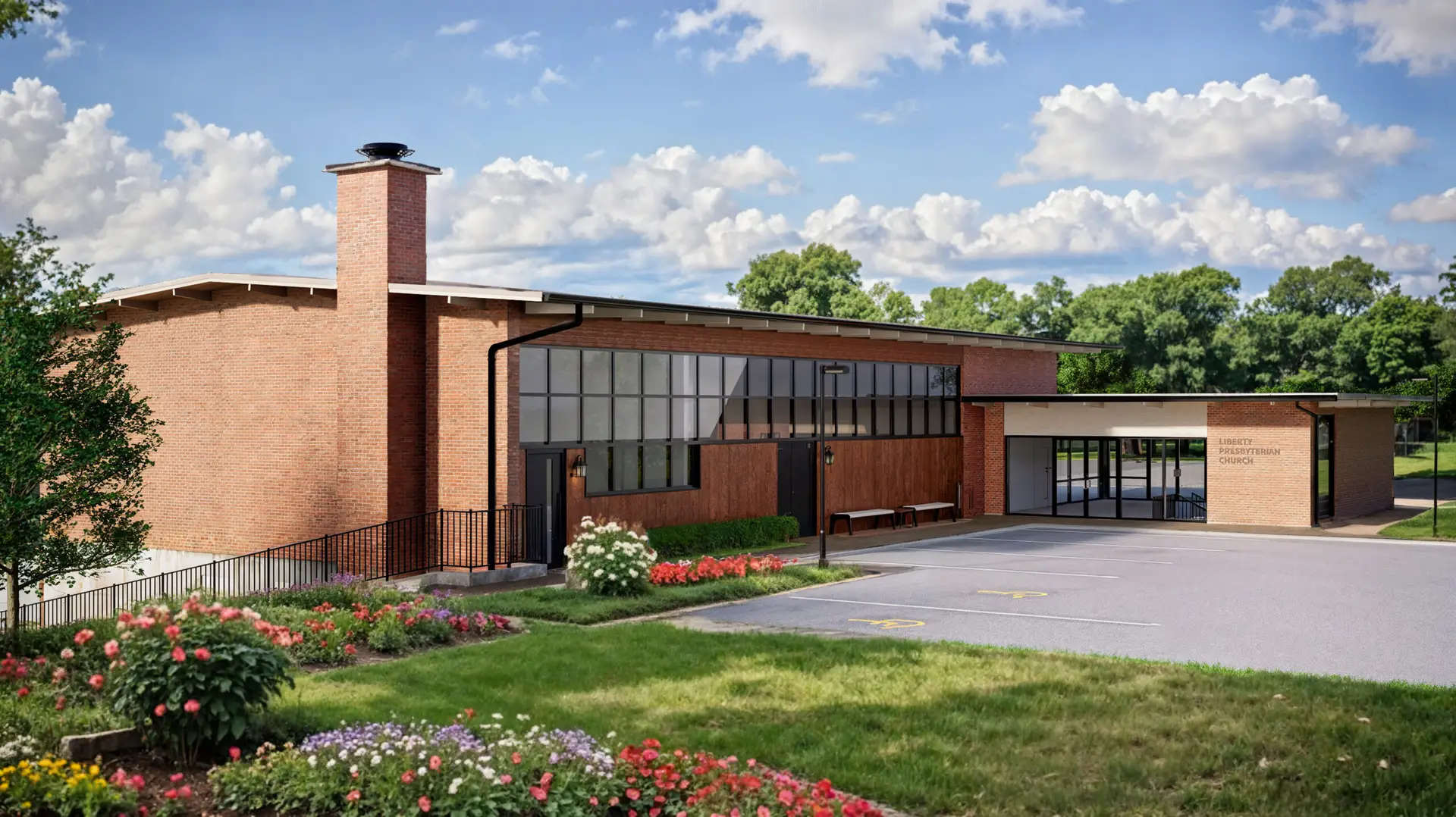
1. Exterior Design: Material Contrast and Functional Courtyard
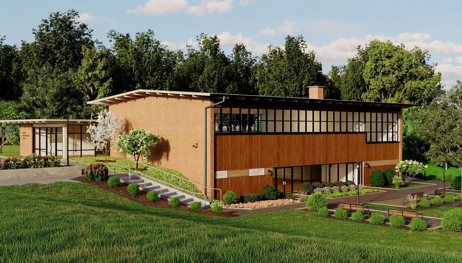
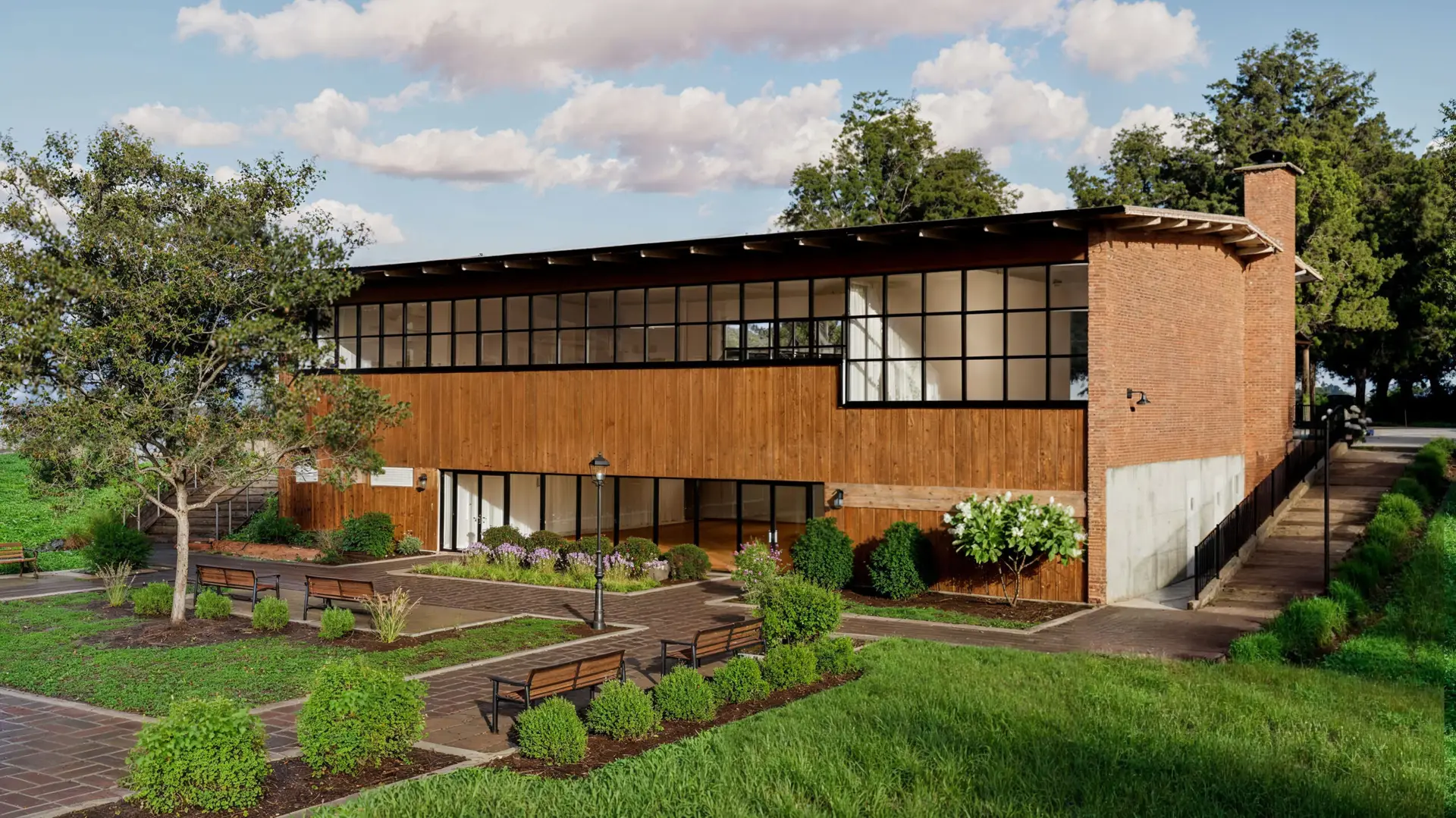
The exterior design strategically employs material contrast to clearly establish the building’s aesthetic and functional hierarchy. The base and main corners of the building are finished with red brick, lending structural stability and preserving the sense of place inherent in its long history. In contrast, vertical wood cladding is applied to the upper and central sections where attention is drawn, alleviating the heaviness of the brick and adding a welcoming warmth. This combination of contrasting materials emphasizes the modern formal beauty of the structure while establishing the aesthetic rhythm sought through the renovation.
Notably, the large glass fenestration divided by dark frames is a key element that adds transparency and lightness to the façade. These windows effectively draw abundant natural light into the interior, visually connecting the inside and the outside. Their horizontally elongated form echoes the characteristics of Mid-Century Modern architecture, reinforcing the building’s horizontal stability. The Forecourt extending across the front of the building is not merely landscaping but a crucial transitional space and buffer zone between the vehicular circulation and the main entrance. Paved with materials and furnished with benches, the courtyard acts as a threshold, guiding pedestrian movement toward the building’s center and providing an informal outdoor gathering area, thus extending the building’s function externally.
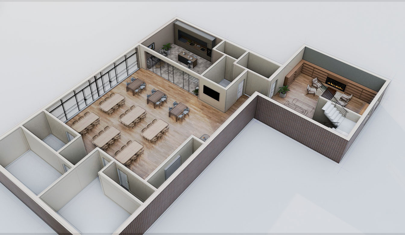
2. Ground Floor Layout: Intersection of Flexible Communication and Functional Circulation
The ground floor layout is designed to achieve two core objectives: open communication and functional efficiency. The Main Community Hall, stretching along the left side of the floor plan, is the central and most open area of the ground floor. Ample natural light is admitted through large windows. The hall’s interior is free of fixed walls and furnished with movable tables and chairs, maximizing adaptability for various purposes such as small group meetings, meals, and large events.
Efficient support spaces are organically connected to the rear of the Community Hall. The Kitchen is strategically located near the hall to minimize circulation for food service, enhancing functional efficiency. On the right side of the floor plan, a more private and comfortable Lounge area is located. Furnished with a fireplace, sofas, and shelving, the lounge offers a space for quiet reflection or informal conversation, serving as a “retreat” from the hall’s lively atmosphere. The lounge is also directly connected to the Stairwell, ensuring efficient vertical circulation to the upper or lower floors, clearly defining the spatial hierarchy and functional separation.
3. Interior Space Design: Architectural Clarity and Resimercial Style
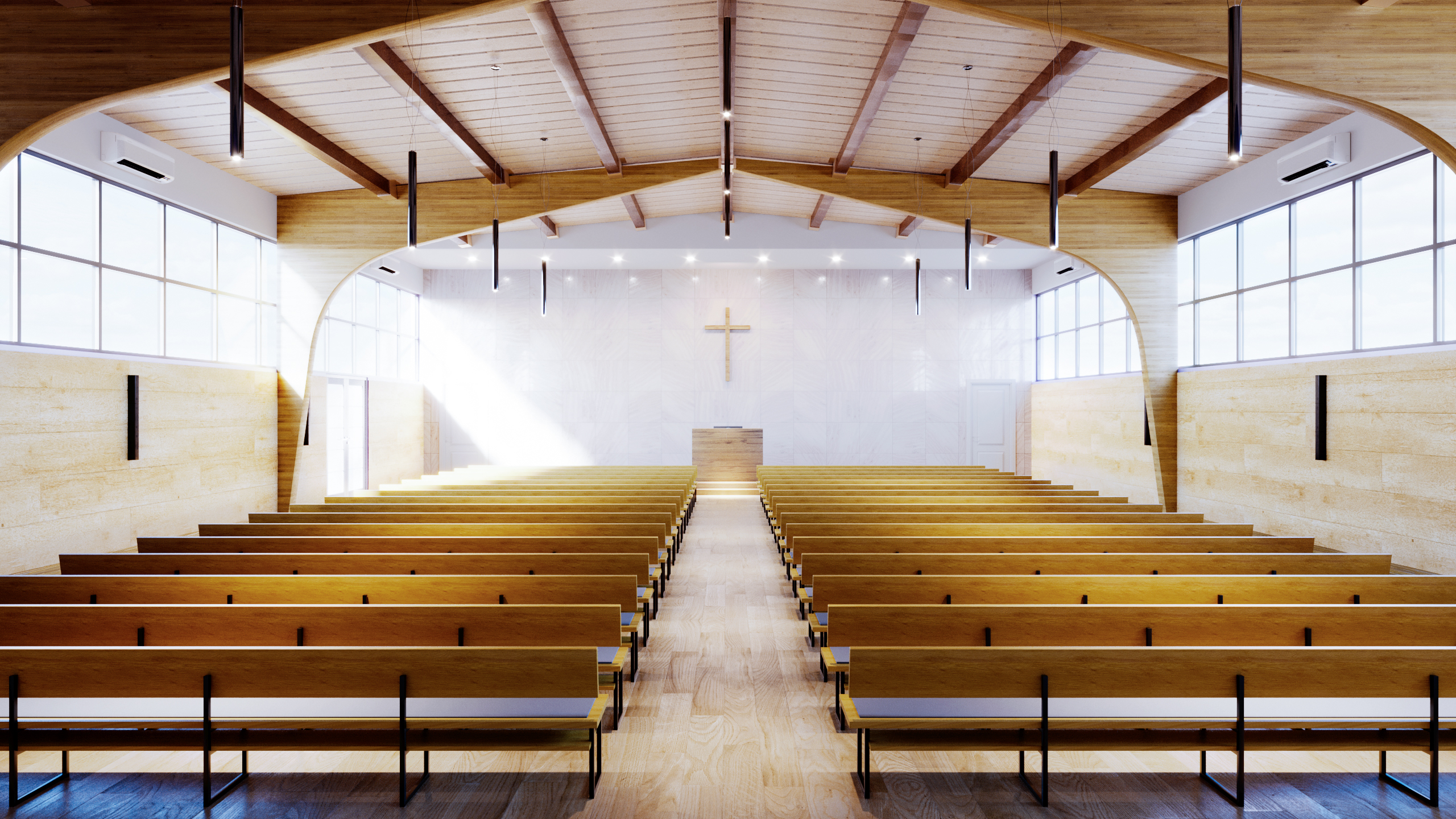
3.1. The Sanctuary: The Refined Sublimity of Light and Wood
The Sanctuary pursues architectural clarity, where structure and material are the design themselves. Upon entering, visitors are struck not by elaborate decoration but by the structure of the arched timber beams in the ceiling. This exposed wooden structure directly reveals the building’s form, imparting a solemn sense of verticality and creating a strong visual axis that naturally guides the eye to the central altar. Materials feature light-toned wood flooring and pews, complemented by textured white walls, ensuring material consistency. Abundant natural light streaming in through the clerestory windows along the side subtly fills the space with sublimity, allowing the light itself to function as a crucial design element.
3.2. Community and Office Space: High-Functionality Resimercial Design
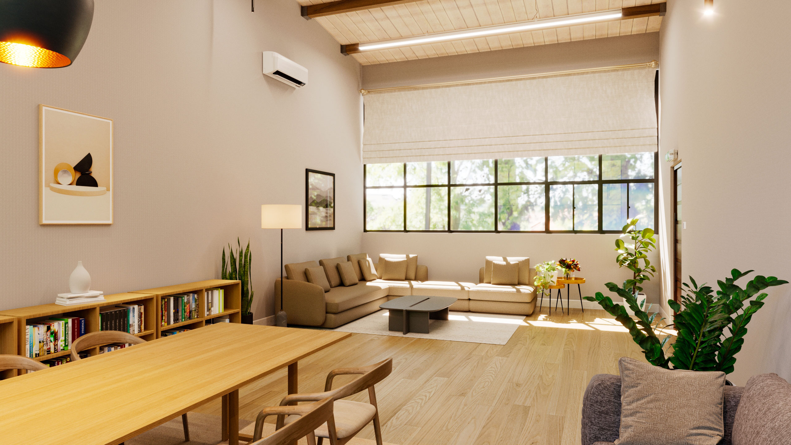
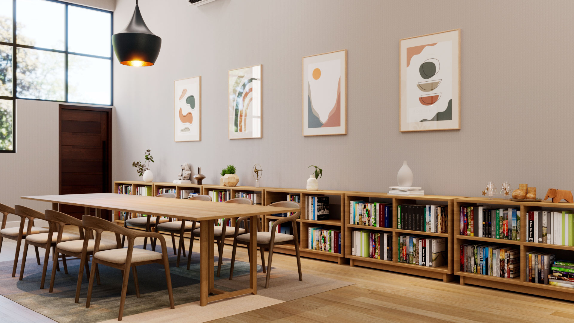
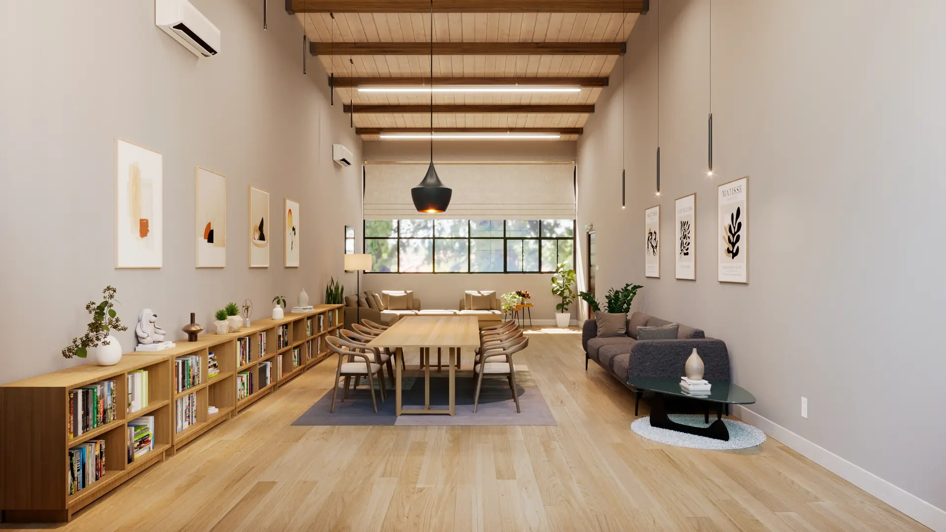
The church office and community areas, which must accommodate diverse functions throughout the week, adopt a High-Functionality Resimercial Design concept. The design maintains thematic consistency with the Sanctuary, utilizing high ceilings and exposed wooden ceiling beams. The central large wooden table supports multi-purpose activities, while surrounding comfortable fabric sofas and modular furniture provide a relaxed environment for rest and fellowship. Low-profile wooden built-in shelving along the walls functionally organizes the space while creating a warm, sophisticated library atmosphere, architecturally encouraging relaxed interaction among users.
Conclusion: The Serenity Afforded by Space
This chapel renovation project achieves success by meticulously balancing three contrasting material properties—solidity (brick), warmth (wood), and openness (glass)—and ensuring flexibility through its functional layout. The space, where light sculpts the architecture and materials add depth, is more than just a religious facility; it is reborn as a modern Sanctuary that offers visitors both inner peace and a breathing space in their busy lives.